The last show I saw at Guerrero Gallery - Sofie Ramos
By Selby Cole
I found out that Guerrero Gallery is losing its space. I was devastated. I found myself reflecting on the last show I had seen there.
I remember the first time I went to Guerrero Gallery for an opening. It was in the industrial part of San Francisco, on a street I had never been on. I walked through a large, lush, verdant garden and plant nursery strewn with expensive Buddhist statues and ornate fountains. Inside, at the back of this nursery, there was a wall that opened up to an even larger white-walled gallery space, with colorful paintings keenly spaced. It had 30’ high ceilings and skylights, a vortex into an oasis. In the back, there was a second story with even more art and a balcony where one could look at the crowds below: looking at people looking at art. I was transfixed. I have seen every show since, sometimes, at the very last minute during the deinstall.
To begin on a tangent, an amusing thing happened to me a few months ago that I was thinking about while viewing Sofie Ramos. I was heading to a show at ATA Window Gallery, a unique gallery space in the Mission because the art there is installed in a window space that faces a busy sidewalk. Because of its location, it attracts a lot of passersby and unintentional art audiences. One night, I was going there to see a show but was blocked by a fistfight. It was the kind of fight where both participants had to be held back. A few weeks later, I was grabbing drinks with the curators at ATA, Tessa Siddle and Ariel Zaccheo, and they said that the fight was over the art being boring. What I find fascinating about this scenario, is not only the person being incensed that the art was boring, but the other person equally riled up defending its boringness—banality as incendiary!
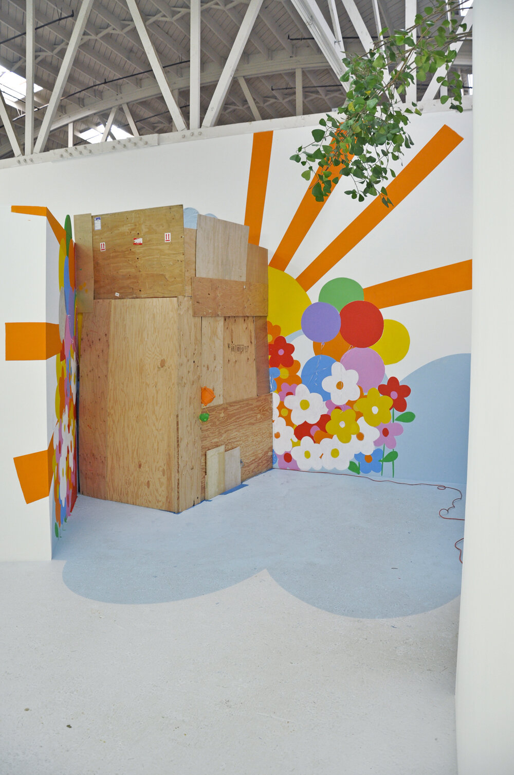
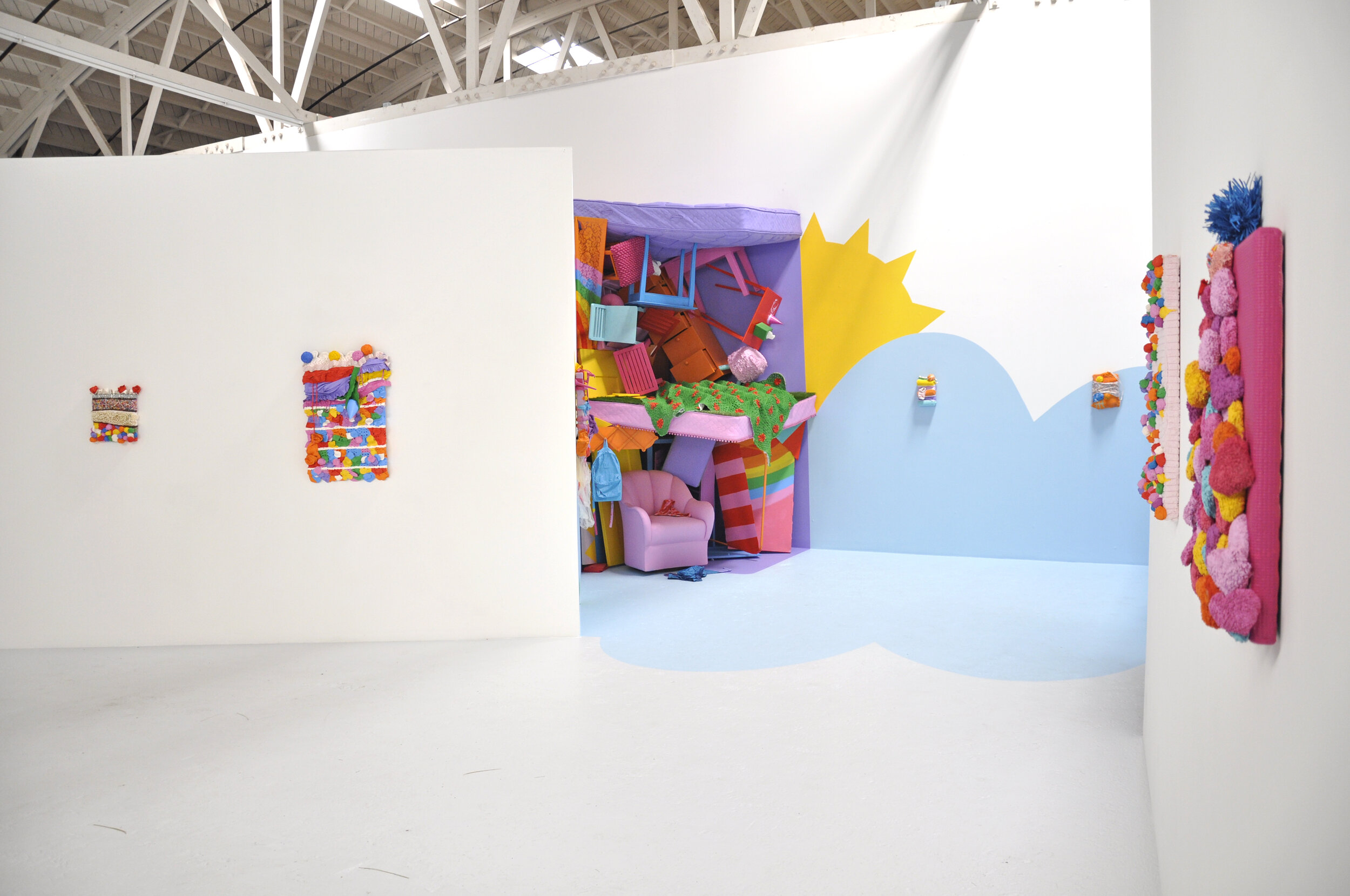
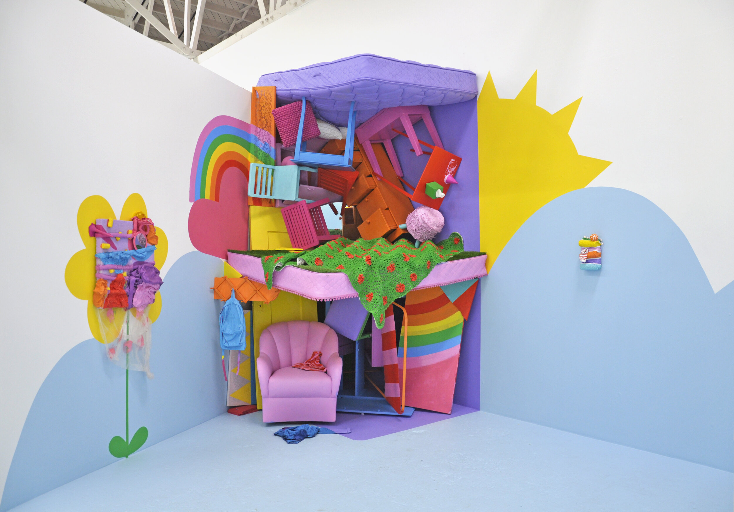
I was thinking about this while I was viewing Sofie Ramos at Guerrero Gallery. Objects were painted in bright, loud colors placed on top of canvases: reds, oranges, pinks, purples, a few yellows, greens, and blues. It was mostly pink. There was so much pink. The colors were intense, saturated on every swath of fabric, in a hyperreal way that didn’t seem possible. It felt like they had left their materiality behind to join a new cult. In a conversation with Andres Guerrero, he mentioned that Sofie layers acrylic painting to build-up the surface on some objects more than others. An initial layer of gloss latex paint is sometimes used because it is more flexible than flat paint. Sofie uses a spray enamel on metal objects as a base because it holds better to the surface, then adds acrylic and/or latex––in this, the colors are similar, that way if the more sensitive top layer chips the base coat off, the enamel stays. The objects were extruding from canvasses, from the surface and the edges, seemingly emerging from the presupposed illusory space, into our actual space. What if canvases did open up, and make what is imaginary suddenly very real? In some of the paintings, objects were arranged to resemble a birthday cake (the only mimesis in the show), reinforcing the feeling of a saccharine, sickly, sweet. In my favorite installation, in a corner, objects were piled up 20' high; it felt like they were falling out of the sky. There were everyday objects, boring objects, in bright colors that felt loud and intense, unruly, counterposed. Banality was, once again, incendiary.


